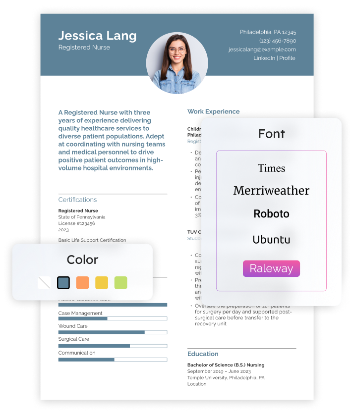
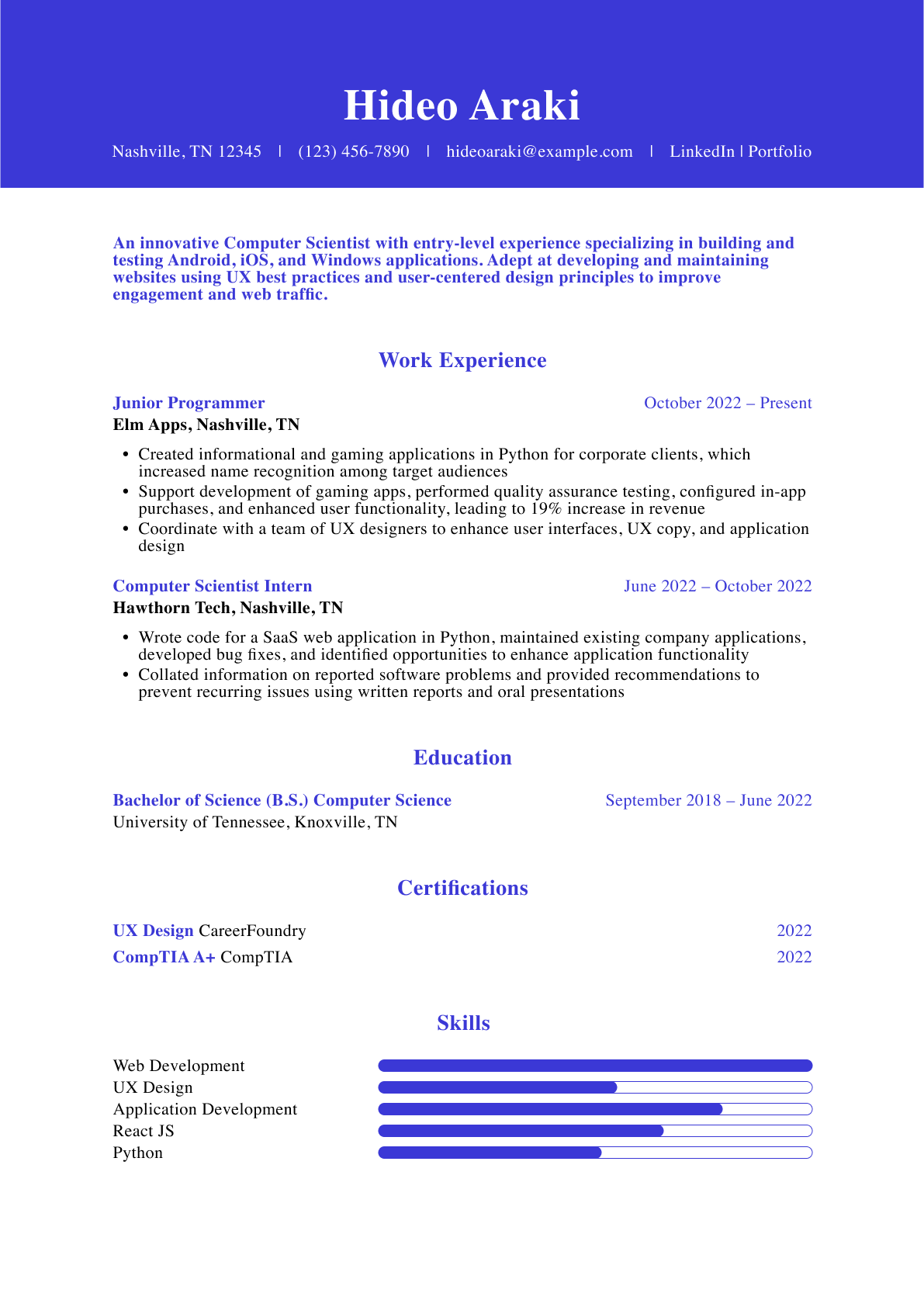
Font style is one of the only resume choices that affect every word of your document on screen. This element should work to your advantage by complementing your resume’s overall format and content. Selecting the best font for a resume is a crucial step in the writing process, yet many people don’t give much thought to the ideal font.
The tips and examples in this guide will help you choose the best resume fonts so you can create a document that effectively presents your career highlights.
Tips for Selecting the Best Resume Font
The best font for a resume should resonate with employers and communicate your understanding of occupational and industry expectations on screen. Before we explore different font options, let’s discuss how to choose the best one for your resume template with the following strategies:
1. Be personal but professional
2. Consider your industry
3. Prioritize readability
4. Choose the right size
5. Use emphasis sparingly
1. Be personal but professional
The best resume fonts are those that balance uniqueness and professionalism without being overly quirky. Lean too far to either side, and you’ll end up with an unprofessional eyesore or an overly formal document lacking personality.
Whether you’re a teenager writing your first resume or a seasoned professional wondering how far back your resume should go, your font is vital in making a strong first impression. Consider the message you want to convey. Once you’re clear on presenting yourself, consider industry standards.
2. Consider the industry
The best fonts for a resume can vary depending on your field. Similar to when you select a template, it’s important to choose a font that aligns with the expectations of potential employers within your industry.
For example, a law firm will expect fonts that are classic, polished, and formal. On the other hand, a tech startup or creative marketing team wouldn’t mind a more modern style.
If you’re not sure what would work best based on your occupation, research the company and choose a font that aligns with its image and brand. Later in this guide, we’ll dive deeper into matching fonts on screen with industry expectations.
3. Prioritize readability
Quick and clear communication is key when writing a resume, and your font should help you accomplish this. Choosing a standard font helps ensure compatibility with applicant tracking systems (ATS) and improves readability. The best resume font is one that prioritizes readability. Selecting an overly stylized or decorative font can hinder you in this effort and won’t sit well with hiring managers.
Legible fonts ensure every part of your document, from the resume summary to the education section, can be effortlessly scanned by human eyes and ATS.
Once you’ve selected your standard font, put it through a few reading tests. Quickly scan it yourself, read it at arm’s length, and have a friend or family member review it — the best resume fonts will be easy to read in all these scenarios.
4. Choose the right size
Did you know that a standard font set to the same point value can still be a different size? For example, the exact same paragraph of text set at a font size of 11 points can take up a different amount of space, depending on the font style. This is something to consider if you’d like your resume to be one page. Using the correct font size ensures your resume maintains an attractive and professional layout that balances text and white space.

In the example above, the top standard font is Bookman Old Style, and the bottom is Garamond. Both are set to the same point value, but there’s a stark difference between them.
When choosing the ideal font for a resume, it’s key to understand how sizing can affect the overall layout. The best resume font looks good in both style and readability. Here’s a quick overview of typical sizing for different elements of a resume:
- Your name: 18 to 24 points
- Body text: 10 to 12 points
- Headings: 14 to 16 points
5. Use emphasis sparingly
It can be tempting to bold, underline, and italicize many parts of your resume, but this can be counterproductive. Even the best resume fonts lose their impact if emphasis is overused. If you’re starting from a blank page and struggling with what to emphasize, keep the following in mind:
- Bold: Your name at the top of the resume and section headers should be bolded and set to a larger size. Job titles and degree names can be bold too.
- Italic: For a subtle emphasis, you can use italics for things like company names, date ranges, and achievements. Use this emphasis strategically.
- Underline: It’s best to avoid underlining as it can make text harder to read and may be confused with hyperlinks.
- Caps lock: Capitalizing all the letters in your headers can work to emphasize a small collection of words. However, it shouldn’t be used for long sentences and paragraphs.
Choosing the Right Font for You
One way to choose the best font for a resume template is with a quick gut decision based on whichever style you like most. Your ideal font should align with industry expectations while reflecting your personal brand. Below, you’ll see the same sentence in 12 different resume font styles.
Before you read the rest of this article, quickly look over each style and choose the one you find most visually pleasing. Write down its number on a Post-it or the notes app on your phone. Then, give the 12 sentences another look and write down one or two more numbers for other styles that jump out at you.
1. The quick brown fox jumps over the lazy dog.
2. The quick brown fox jumps over the lazy dog.
3. The quick brown fox jumps over the lazy dog.
4. The quick brown fox jumps over the lazy dog.
5. The quick brown fox jumps over the lazy dog.
6. The quick brown fox jumps over the lazy dog.
7. The quick brown fox jumps over the lazy dog.
8. The quick brown fox jumps over the lazy dog.
9. The quick brown fox jumps over the lazy dog.
10. The quick brown fox jumps over the lazy dog.
11. The quick brown fox jumps over the lazy dog.
12. The quick brown fox jumps over the lazy dog.
When you scroll down, you can then find the numbers for your corresponding font choices as well as tips and considerations for making them work on your resume. Once you’ve decided on your standard font choices, you can use Wordmark to compare and contrast fonts side-by-side.
A note on serifs
As you read the descriptions of your chosen styles below, you’ll see each font is referred to as either “serif” or “sans serif.” A serif font has little decorative “tails” on its letters, while a sans serif font does not. These “tails” are commonly thought to make a serif font more aesthetically pleasing and readable than a sans serif font. But that’s not always the case, especially when scanning text quickly on a computer screen. When viewed on screen, sans serif fonts like Calibri and Arial often have superior readability.
For instance, you’ll probably find a long block of online text easier to read in Calibri (sans serif) than in Book Antiqua (serif). The serif/sans serif distinction is a helpful way to understand fonts in general but shouldn’t weigh heavily when selecting the best fonts for a resume.
12 Great Fonts for Your Resume
Now that we’ve discussed how to choose the best fonts for a resume let’s explore a few options. The following fonts are common enough to find within most word-processing programs but have distinct personalities on screen. We’ll discuss each font’s strengths and different ways they can be used within a resume.
1. Arial Narrow
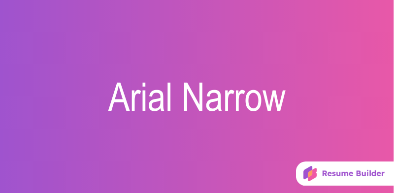
Arial Narrow is a tidy sans-serif font that, true to its name, packs an impressive amount of text into a small amount of page space. That attribute makes Arial Narrow an ideal font for executives or other job seekers with extensive career information struggling to keep their resumes to just a few pages.
If you use this font for your resume’s main text, consider using Arial Black for your subject headings or job titles – the two fonts complement each other perfectly.

When using Arial Narrow, pay extra attention to your resume’s overall layout and white space. Its condensed nature will help you fit more information into your resume but could lead to an overcrowded look. Remember that readability should be a top priority and not sacrificed for the sake of aesthetics or trying to fill your page with too much information.
This is a versatile font and would be well-suited for occupations within the following sectors:
- Business
- Engineering
- Government
- Health care
- Legal
- Technology
2. Book Antiqua
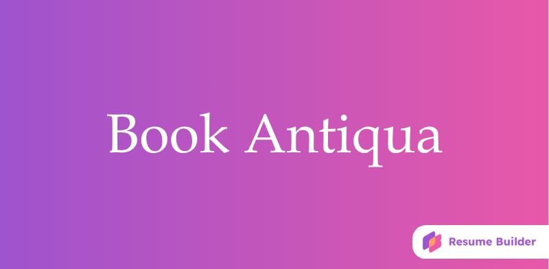
Book Antiqua is the most elegant serif font on this list, but it’s also the most ornate. As such, it can look a little “heavy” as the font for a longer resume with extensive bullet points and job descriptions.
You can alleviate this problem by increasing your document’s line spacing a little, or by opting for a “lighter” sans serif font (like Corbel or Tahoma) as your subject headers. Stylistically, Book Antiqua can be a great fit for job seekers in academia and other traditional occupations.

This font and other serif styles can help convey a sense of experience and expertise within your field. Professionals working within established environments like the ones below could benefit from a font like Book Antiqua:
3. Bookman Old Style
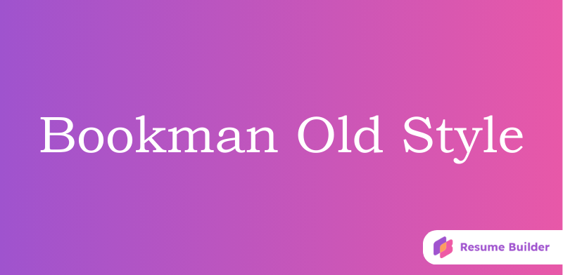
This font’s name may suggest you’ll come off as bookish and old. But actually, Bookman Old Style is one of the fresher and more modern-looking serif fonts. (For instance, it makes a far “lighter” impression than Book Antiqua).
Note that Bookman Old Style runs larger than other fonts, so if you choose it for your resume, you may want to reduce your text size by a point or two. Otherwise, you run the risk of expanding beyond the standard single-page resume.

Striking a balance between traditional and modern styles, this font is best for professionals in fields that emphasize both innovation and tradition. For example:
4. Calibri
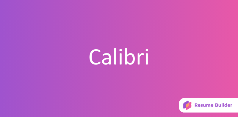
Calibri is Microsoft Word’s default font style and deserves to be. This simple, polished font beats out virtually all the others for clarity and readability. You’ll find it ranked No. 1 on many lists of the best fonts for a resume.
Regardless of your profession or career level, Calibri can make a great font choice for your resume. From tech startups to established law firms and everything in between, this is a solid choice for any industry.

Due to its popularity, using Calibri may make it harder for your resume to stand out from other applicants. Some may see it as the “default” option and lacking a personal touch. However, its wide usage means that hiring managers are used to reading it. This familiarity may ultimately help you by drawing the focus to what’s most important — your career highlights.
If you work within these sectors, Calibri could be a great choice for you:
5. Cambria
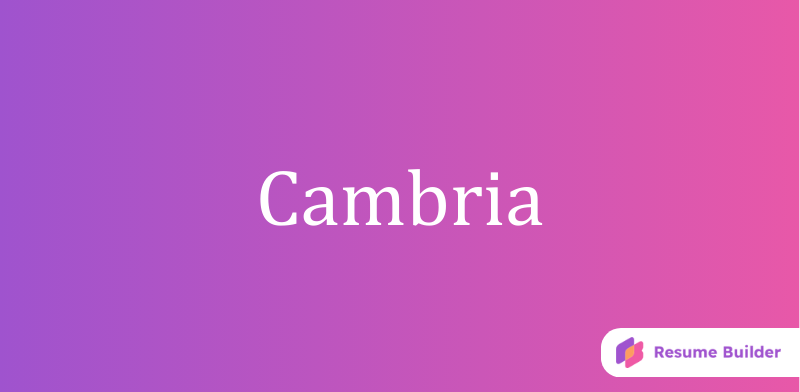
Think of Cambria as the serif version of Calibri. It’s slightly more formal and stylized but also one of the most useful and versatile resume fonts out there — an excellent choice for almost any job seeker. Designed for on-screen reading, this font performs well within a digital format, making it a great option for online applications and emailing resumes.

Similar to Calibri, this is another font favorite widely used by professionals. So, remember to utilize bold emphasis and sizing to differentiate your document.
Occupations within the digital realm would benefit most from using Cambria. Consider using this font if you’re applying for jobs in the following work environments:
- Design
- Digital marketing
- E-commerce
- Information technology
- Telecommunications
- Web development
6. Century

Despite its somewhat antiquated look, Century is a popular, conservative serif font that conveys professionalism and reliability. It can serve your resume well if you work in a more traditional industry, like banking or book publishing. Also, Century looks great in small caps, making it a good option for your section headings and other prominent resume text.

Century was initially created for books, newspapers, and magazines, so if you plan on printing out your resume, this is a solid choice. However, because this font is more than a century old, it can appear outdated in some contexts. Professionals within a creative or more modern industry may want to avoid it. Century could be great for individuals within:
- Accounting
- Education
- Finance
- Government
- Insurance
- Legal
7. Corbel

Corbel gives Calibri a run for its money as the best all-around sans-serif font. It’s slightly less formal but otherwise about equally clear and polished. One quirk to keep in mind: Corbel gives different vertical positioning to individual numbers. (Try typing 1234567890 in it, and you’ll see.)
Some people like how that displays their phone number, but others find it distracting. Depending on your specific digits, it can make your phone number look like it’s playing hopscotch. A quick fix: Use Calibri as your contact header font instead.

This font’s clean, contemporary look is perfect for both digital and print resumes. Clean lines and plenty of spacing make reading a breeze. Regardless of your occupation, Corbel could easily work for most any resume. With a more modern aesthetic, it would best work for jobs related to:
8. Franklin Gothic Book
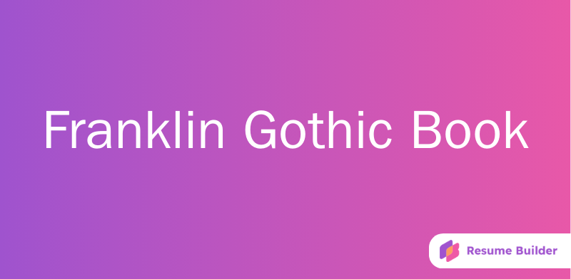
Franklin Gothic Book is probably the most formal-looking sans serif font on this list, but it’s well-suited for job seekers in many fields. If you use it as your resume’s main font, consider using Franklin Gothic Medium for your name and subject headings. This will help establish a clear structure and make it easy for hiring managers to navigate your document.

Used by famous publications like Time Magazine and The New York Times, the Franklin Gothic font family is a timeless choice. Its balanced weight and clean lines make it perfect for professionals within the corporate realm. Consider using this font, especially if you work within the following sectors:
- Advertising
- Communications
- Consulting
- Media
- Public relations
- Real estate
9. Garamond
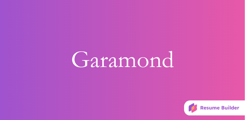
Garamond is often promoted as a viable alternative to the overused Times New Roman. It has a smooth, professional design and is one of the best resume fonts for a classic look. But, like Century, Garamond can come off a bit old-fashioned. Also, note this style makes small/italic text hard to read, so if you use Garamond, avoid italics where possible and don’t make your resume’s body text smaller than 11.

If you’re a professional within a traditional industry or simply looking for a distinguished touch, pair Garamond with a sans-serif font for your name and resume headings. Because this font can appear formal, it’s a great choice for roles within these fields:
- Arts and culture
- Education
- Humanities
- International relations
- Luxury goods
- Publishing
10. Tahoma
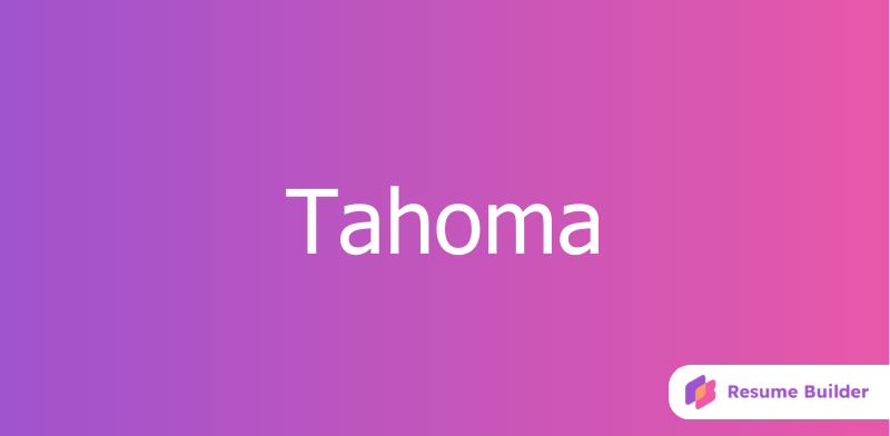
A clear and friendly-looking sans serif font, Tahoma could almost be related to the often-mocked Comic Sans. But don’t let that scare you off this popular, perfectly professional text style. This approachable font can work to your benefit, especially if you’re applying for customer service roles.

Tahoma is also a go-to for many job seekers in tech, but it’s versatile enough to work in many other fields. It’s a modern option that lends itself well to a range of professionals within:
11. Times New Roman
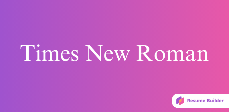
Despite its classic reputation, Times New Roman may not always be the best choice depending on the job and industry. Resume experts generally advise against Times New Roman, saying it’s overused and won’t help you stand out from other applicants. But they’ve been saying that for at least 15 years, and job seekers have listened.
Nowadays, far fewer resumes appear in Times New Roman, so use it with confidence if you prefer it to the other fonts. Judged strictly by its merits, Times New Roman has a graceful, even appearance that’s well-suited to resume design.

Times New Roman, this classic standby, is readily available on most computers. If you’re under a time constraint and struggling to make a decision, this is a safe bet. You’ll create a professional, sophisticated document that works well for cover letters too. Due to its traditional aesthetic, Times New Roman typically fits best within the industries below:
12. Verdana
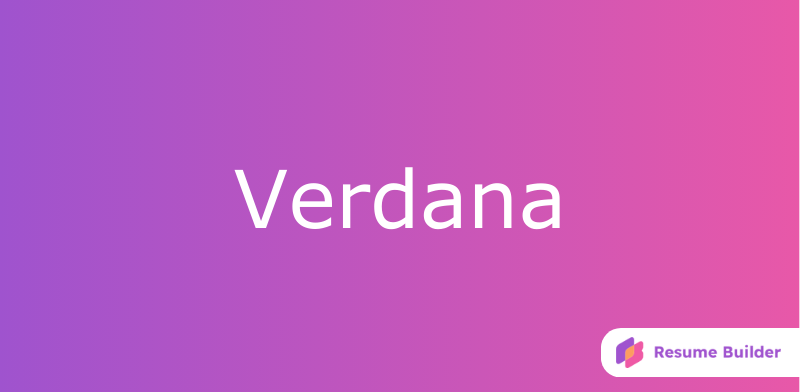
Among top-rated resume fonts, Verdana is arguably the least elegant. Yet it makes up for that with a bold, no-nonsense look ideal for many corporate job searches. Like Bookman Old Style, Verdana’s letters run larger, so reduce your text size by a point or two.

This is another font created for Microsoft in the 1990s, specifically for computer use, making it a great option for the digital resume. The various weights in this typeface family were designed to contrast well, making it easy to utilize the font in various ways, from headings to paragraph text.
Since Verdana was designed with the computer screen in mind, this is a strong choice for professionals who work within:
- Cybersecurity
- Design
- Digital marketing
- E-learning
- Gaming
- Technology
Frequently Asked Questions About Fonts for Resumes
What is the best font for a resume?-
It would be easy to officially name one “the best resume font,” but there’s no one-size-fits-all answer here. Think about what’s best for you and your field. Then, choose a font that allows your qualifications to shine without distracting the hiring manager.
What font size is applicant track systems friendly?-
Many employers rely on ATS software to filter through submitted resumes. When choosing the best resume font size for you, it's crucial to consider ATS compatibility. Before your resume gets to the hiring manager, there’s a good chance that a computer program will be the first to read it.
Sometimes ATS algorithms have a hard time analyzing overly complex designs and fonts. So, stick with font size 11 or 12 and lean toward more traditional fonts such as Arial Narrow, Calibri, and Times New Roman.
Which font style is not recommended for a resume?-
Beyond the obvious decorative options such as Broadway or Jokerman, a few common fonts should be avoided. Comic Sans, Papyrus, Impact, and any scripts are not the best options for a resume. Here’s a good rule of thumb: if you wouldn’t use it in a work email, it probably doesn’t belong on a resume.
What is the best font color for a resume?-
The best font color is strong, clear, and professional. Black is your go-to color, like a classic pair of black slacks in an interview — you can’t go wrong. If you’re set on using any other color, stick with dark shades of navy blue or dark gray. These colors can be used strategically throughout your resume for headings or subheadings. If you’re ever in doubt, play it safe with black on white.
Craft your perfect resume in minutes
Get 2x more interviews with Resume Builder. Access Pro Plan features for a limited time!


