
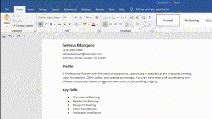
In the guide below, we’ll walk you through the key settings you’ll need to familiarize yourself with to create a professional-looking resume in Microsoft Word. There’s no need to turn in something that looks like it was pecked out on a typewriter. Putting a little time and effort into formatting your resume can make the difference between a hiring manager passing you by or catching their eye.
The following suggestions will be a jumping-off point based on general best practices for crafting a resume. You can tweak these default settings based on your preferences or industry standards.
Font Settings
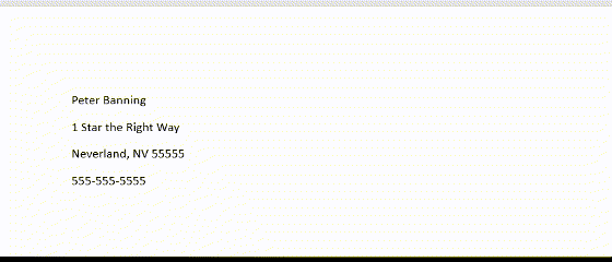
Font size
Home: Font
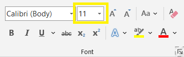
While 11-point font is typically the gold standard size these days, certain things should be bigger to highlight important points (your name) or as a way to organize your resume’s sections.
Set your name to 17, section headings to 14, and all other text to 11.
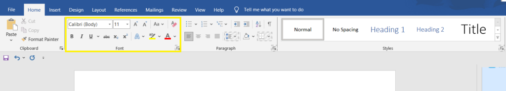
Font style
Home: Font
Don’t use more than two fonts on your resume (one for your name and section heading and one for everything else). For most traditional industries, stick with traditional resume fonts like Calibri or Cambria.
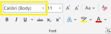
Font color
Home: Font
For a simple resume format, stick with black text throughout. If you’d like to introduce color, see the tip on shading below.
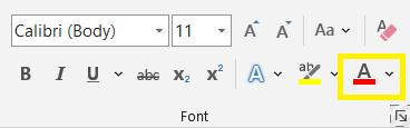
Bold, italic, underline
Home: Font
Use bold for all titles (e.g., your name, job titles, and college degrees) and italic for all organizations (e.g., past employers and schools).
But keep in mind bolded text stands out more than italicized text. So you may want to reverse this setting if your past job titles are now less important than your employer names.
Generally, avoid underlining text on your resume, except hyperlinks.
CAPS and Small Caps
Home: Font: dialog box launcher (arrow in the bottom-right corner): Effects
Use all caps or small caps for your section headings to help set them off from the other information. (You can also use caps to set off job titles and organizations.) But note that caps make the text slightly harder to read, so don’t use them if your section headings are long or uncommon (e.g., Presentations and Publications, not PRESENTATIONS AND PUBLICATIONS).
Paragraph Settings
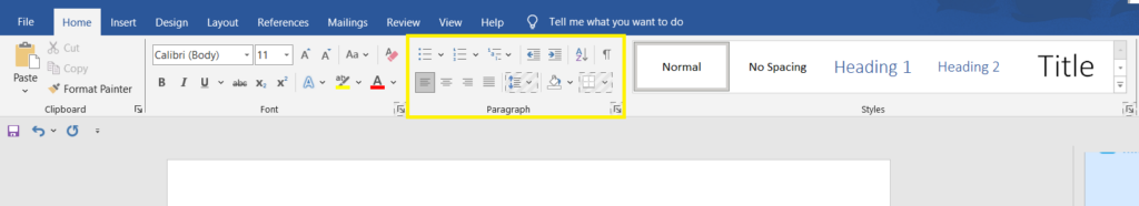
Line spacing
Home: Paragraph
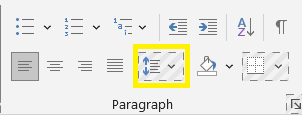
Keep your entire document at Word’s default paragraph spacing of 1.15.
Text alignment
Home: Paragraph
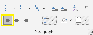
In general, set the entire document to “Align Left.” This is the standard alignment most people are used to, and anything else can feel jarring. However, as a final formatting step, consider setting your name, contact info, section headings, and text of shorter sections to “Center” for a more balanced look.
Bullet points
Home: Paragraph
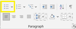
Use bullet points to set off all the achievements in your Experience section. Also, consider bulleting your job duties and profile summary.
Use either the standard circle symbol or a simple alternative such as squares, diamonds, arrows, or check marks.
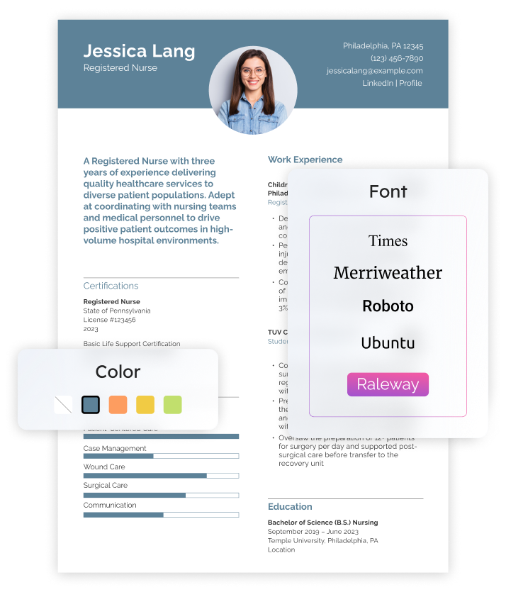
Shading
Home: Paragraph
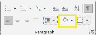
Add light gray shading behind your name, contact info, and section headings. You can also use color, but make it a light tint so you don’t obscure the text. Also, consider shading for any atypical text on your resume, such as client testimonials or special awards.
Borders
Home: Paragraph
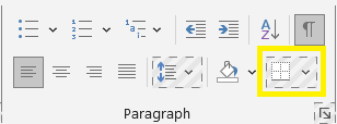
Add a slim border below each section heading and a slightly thicker border below your contact info.
Layout Settings
Point spacing
Layout: Paragraph
Before you set your resume’s point spacing, it’s a good idea to delete all “empty” paragraphs. Click the Show/Hide button (Home: Paragraph) to make all paragraph marks visible on your document (they look like a backward P). Then delete all paragraph marks that have no accompanying text, i.e., those that are flush against your left margin.
Once you’ve deleted all empty paragraphs, set “After” spacing to zero points for the entire document.
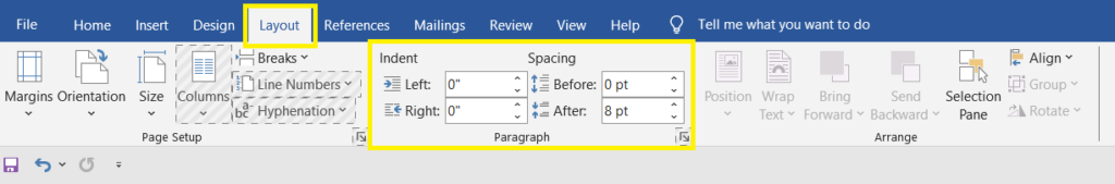
Set “Before” to:
- 14 points for all section headings
- 5 points for all bulleted information
- 11 points for all other information
Page margins
Layout: Page Setup: Margins: Custom Margins…
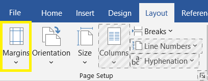
Page margins are the white space on every side of the page. While you can adjust the margins later if you feel you need more or less white space, set the margins to 0.7” on all four sides by default.
Columns
Layout: Page Setup
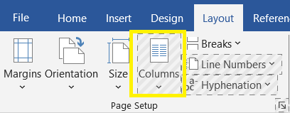
Keep your entire document as one column. When a resume section comprises many short items or phrases (e.g., the key skills section), you can use the pipe symbol or tab stops to consolidate them and avoid having too much white space.
Frequently Asked Questions About Formatting Your Resume in Word
What can I do about extra blank space? -
After formatting your resume text, you may have a mostly blank second or third page. Extra space may also be created when the last word of a paragraph or bullet point appears on its own line. Remember, the above recommendations are just a starting point. Feel free to tweak them to solve these or other spacing issues that arise.
If your document text runs onto an extra page, make your page margins smaller (but don’t go below 0.5” on all sides). Then reduce the font size or point spacing slightly. Also, delete the document’s headers and footers, or shift their position since they can interfere with whatever page margins you’ve set.
If the last word of a paragraph or bullet appears on its own line, play around with Word’s hyphenation and character spacing options. These settings can help you condense the text slightly so that the extra line disappears.
Only delete resume text as a last resort.
What Word settings can I ignore? -
For the purposes of a standard resume, you can safely ignore many of Word’s more advanced settings and features, such as:
- Content controls
- Illustrations
- Section breaks
- Styles
- Tables
- Text boxes
- Text effects
- Themes
Features like these are generally meant for longer Word documents with more sophisticated formatting demands. Leaving them off your resume makes it much simpler and easier to update with new information later.
What about applicant tracking systems?-
The above recommendations will help your resume perform better on applicant tracking systems (ATS) platforms. Generally, a simple and consistent resume format is likelier to pass ATS and reach a hiring manager's desk.
Craft your perfect resume in minutes
Get 2x more interviews with Resume Builder. Access Pro Plan features for a limited time!